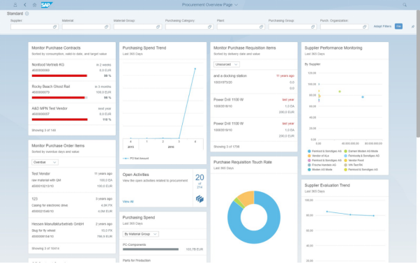
Dashboards and reports
Both reports and dashboards offer key benefits, and each is accompanied by their own limitations. The first major area where each offers a different advantage is in scope. Dashboards can really include any number of data points and sets, though they are best employed when they focus on specific aspects of an organization. Some dashboard examples include tools that track help desk tickets, relative market share, investment portfolios, and other specific
Reports, on the other hand, have the benefit of a broader scope. Because they’re not live and can be curated, reports can offer a better high-level view of an organization. A manager or CEO may not need to see specific dashboards for customer support, but he would benefit from understanding how the whole customer service department is operating.
The second key difference in each is data timeliness. Reports tend to be broader and feature historic data. Because they must be delivered periodically, they represent a snapshot of a specific area or organization rather than its real-time situation. Dashboards, on the other hand, are built to visualize and organize data in real-time. They can be modified to alert users when specific metrics change, or thresholds are met.
Finally, dashboards also allow users to manipulate and interact with data dynamically, whereas reports show a static picture of the existing data. Generally, dashboards are optimal for everyday analytics and BI needs, while reports are useful to capture static data. Furthermore, dashboards are ideal for compartmentalization and better monitoring of specific metrics and functions.

